How to Design a QR Menu Customers Actually Use
Introduction: Why QR Menu Design Makes or Breaks Adoption
Many restaurants launch QR menus with good intentions—only to find customers ignoring them, asking for printed menus, or complaining about usability. The problem usually isn’t the QR code itself; it’s poor QR menu design.
Customers will only use QR menus if they’re easy, fast, and pleasant to navigate. Strong QR menu usability removes friction, builds confidence, and helps guests order without thinking twice—especially when restaurants clearly understand what a QR menu is and how it should function.
This guide breaks down exactly how to design a QR menu that customers actually want to use—based on real behavior, not assumptions.
What QR Menu Usability Really Means
QR menu usability is about how easily a customer can:
- Scan the code
- Load the menu
- Read and understand items
- Find what they want
- Make a decision quickly
If any step feels slow, confusing, or uncomfortable, customers abandon the QR menu. It is critical to consider usability as a foundational aspect in the implementation of digital menus.
Principle #1: Make the Menu Load Instantly
Speed is the first test of usability in your QR menu design. Users expect instantaneous access to information, and anything slower risks losing potential orders.
Best Practices
- Use lightweight pages
- Optimize images
- Avoid unnecessary animations
- Host menus on reliable servers
If your menu takes more than a few seconds to load, usability suffers—no matter how good the design looks. This is why fast, synchronized updates—like those covered in how QR menus speed up table turnover—are critical.
Principle #2: Design for Mobile First (Always)
QR menus are viewed almost entirely on phones, which means your design should prioritize mobile user experience.
Mobile-First QR Menu Design
- Single-column layouts
- Large, readable text
- Buttons sized for thumbs
- Minimal zooming or pinching
Desktop-style menus shrink badly on phones and hurt QR menu usability. Keeping a mobile-first approach is essential to retaining customer engagement.
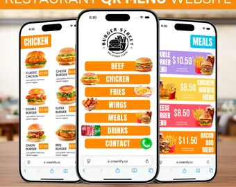
Principle #3: Keep Layouts Simple and Familiar
Customers don’t want to learn a new interface just to eat. They want familiarity, which gives them confidence in navigating the menu.
Good Design Feels Familiar
- Clear categories (Starters, Mains, Drinks)
- Vertical scrolling instead of horizontal
- Consistent spacing and alignment
Overly creative layouts often reduce usability. Research shows that customers prefer designs they’re accustomed to, as outlined in studies of digital interface expectations.
Principle #4: Use Readable Fonts and Strong Contrast
Text readability is a top reason customers abandon QR menus. Therefore, typography plays a significant role in the overall user experience.
Typography Best Practices
- Sans-serif fonts
- Minimum 14–16px body text
- High contrast (dark text on light background)
- Avoid light gray text
Readable text is foundational to good QR menu design. Poor readability not only frustrates users but may also lead to incorrect orders.
Principle #5: Limit Scrolling Fatigue
Endless scrolling frustrates users, leading to a negative experience with your menu. It’s essential to design your menu in a way that minimizes scrolling effort.
Reduce Scroll Length By
- Using collapsible categories
- Keeping descriptions concise
- Avoiding unnecessary filler text
Customers should reach most items within a few swipes. This straightforward approach can help enhance the overall usability of your QR menu.
Principle #6: Show Prices Clearly and Consistently
Hidden or inconsistent pricing damages trust. Customers need to see full pricing transparency to feel confident in their selections.
Best Practices
- Place prices in the same spot for every item
- Avoid tiny or faded prices
- Don’t hide prices behind taps
Clear pricing improves confidence and speeds decisions. Ensuring that prices are simple to locate can significantly enhance order velocity.
Principle #7: Use Photos Strategically (Not Everywhere)
Photos improve engagement—but too many slow menus down and can sometimes be counterproductive to usability.
Smart Photo Use
- Feature bestsellers or high-margin items
- Use high-quality, real food photos
- Avoid stock images
Balanced visuals boost customer interest without degrading QR menu usability. Attention to detail, especially in visual elements, is paramount to ensuring a seamless experience.
Principle #8: Make Add-Ons and Options Obvious
Upsells should feel helpful, not forced. Providing clear add-on options can enhance the dining experience.
Effective Add-On Design
- “Add extra cheese”
- “Upgrade to large”
- “Best with this dish”
Clear options increase order value without confusing customers, as discussed in strategies for how QR menus increase average order value.
Principle #9: Reduce Clicks and Taps
Every extra tap increases friction, which can frustrate customers. Aim for a design that streamlines decision-making.
Aim For
- Minimal pop-ups
- Fewer nested menus
- Important info visible immediately
Great QR menu design minimizes effort, paving the way for smoother user experiences.
Principle #10: Design for Accessibility
Accessibility is usability for everyone, and good design should ensure that no one feels left out.
Accessibility Essentials
- Zoom-friendly layouts
- Large tap targets
- Clear allergen labels
- Screen-reader compatible structure
An accessible QR menu is simply a better menu—and a key part of the complete QR menu setup checklist for restaurants. Designing with accessibility in mind broadens your customer base and makes dining more inclusive.
Common QR Menu Design Mistakes to Avoid
Avoid these usability killers:
- Tiny text
- Overcrowded layouts
- Slow-loading images
- Too many categories
- No instructions
Most QR menu usability complaints come from these errors. Rectifying these common pitfalls can elevate your menu design significantly.
QR Menu Design Checklist
Use this checklist before launch:
✅ Loads in under 3 seconds
✅ Mobile-first layout
✅ Readable text and contrast
✅ Clear categories
✅ Consistent pricing
✅ Limited, optimized images
✅ Accessible design
✅ Tested on multiple phones
If you check all these boxes, customers will use your menu, increasing both user satisfaction and business results.
How to Test QR Menu Usability
Before rolling out:
- Scan the menu in low lighting
- Test with older phones
- Ask staff to order from it
- Watch customers use it without help
Real-world testing reveals issues quickly—especially before you officially launch your QR menu. This phase allows you to identify and resolve any overlooked issues.
FAQs About QR Menu Design
What makes a good QR menu design? Fast loading, mobile-first layout, and clear readability.
Why do customers avoid QR menus? Poor usability, slow speed, and hard-to-read designs.
Are photos necessary for QR menus? Helpful, but only when used sparingly and optimized.
How long should a QR menu be? As short as possible—only what customers need.
Do QR menus need accessibility features? Yes. Accessibility improves usability for everyone.
Should restaurants keep printed menus too? Yes, as a backup and accessibility option.
Conclusion: Usability Is the Real Secret
Ultimately, the success of a QR menu doesn’t depend on technology—it depends on design. When QR menu design focuses on speed, clarity, and simplicity, customers will use it naturally and confidently.
Strong QR menu usability reduces friction, speeds ordering, and improves satisfaction. Get the basics right, avoid overdesign, and always design for the customer—not the trend. By following the guidelines discussed in this post, you’ll also discover how QR menus help prevent menu errors and reduce waste, contributing to a better dining experience for everyone.